

Monograms for Couples: Guide to Etiquette & Style
Title: Monograms for Couples Guide to Etiquette and Style
Meta description: Learn how monograms for couples work, from classic etiquette to modern styles, naming formats, and elegant placement for gifts, weddings, and home details.
You've found the perfect wedding gift, anniversary present, or party detail. Then one small question stops everything. What, exactly, is the correct monogram for a couple?
That hesitation is completely understandable. Monograms look effortless when they're done well, but the rules can feel like a private code. Which initial goes in the middle? Does the woman's letter go first? What happens if the couple keeps separate surnames, uses a hyphenated name, or wants something more modern than tradition suggests?
The good news is that monograms for couples aren't mysterious once you understand the logic behind them. The old etiquette rules weren't invented to make things fussy. They developed to make a monogram readable, balanced, and recognizable at a glance.
That's why a beautiful couple's monogram still feels so special. It isn't just decoration. It's a shorthand for shared identity, whether it appears on wedding stationery, cocktail napkins, a linen towel, or a thoughtful bottle gift.
If you're choosing a monogram for your own celebration or ordering one for someone you love, the goal isn't to memorize stiff rules. The goal is to make confident choices. A good monogram should feel personal, polished, and suited to the life the couple is building.
Introduction
A couple's monogram often appears at moments that already carry meaning. Engagements, weddings, anniversaries, housewarmings, holiday hosting. In each of those settings, the monogram acts like a visual signature for the pair.
That's one reason the tradition has lasted. It gives ordinary objects a sense of occasion. A stack of napkins becomes party-ready. A bottle bag becomes a keepsake. A set of towels starts to feel like part of a home, not just part of a registry.
Practical rule: A monogram works best when it answers two questions clearly. Who does this belong to, and what feeling should it create?
People get confused because etiquette and style are often mixed together. Etiquette tells you how initials are commonly arranged. Style determines whether the result feels formal, playful, minimal, romantic, or crisp.
Once you separate those two ideas, everything becomes easier. First, identify the naming structure. Then choose the look that matches the couple and the item.
A monogram for barware doesn't need to look like a wedding crest. A monogram for cocktail napkins doesn't need the same scale or flourish you'd use on a tote or a robe. The smartest choices come from understanding the purpose behind the design.
The Art of the Couple's Monogram
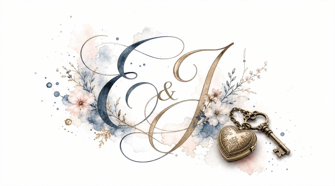
A couple's monogram is more than initials grouped together. It's a visual expression of partnership. That may sound lofty for a set of letters, but anyone who has seen a monogram on wedding paper, silver, or linens knows the effect. It turns names into identity.
Historically, that symbolism mattered. Leatherology notes that monograms were traditionally associated with “the wealthy and royalty,” and that monogramming remains common across embroidery, debossing, embossing, engraving, and etching in modern use, which helps explain why the tradition still feels formal and enduring in gifting today (Leatherology monogram etiquette basics).
Why the tradition still feels relevant
The old association with status has shifted into something more intimate. Today, monograms for couples signal intention. They suggest that the item was chosen, not grabbed at the last minute. They also carry a sense of continuity. A monogram can move from wedding weekend to home entertaining to anniversaries without feeling dated.
That's especially true for household pieces. The same design can live on stationery, cocktail napkins, trays, towels, and guest room details. If you're interested in seeing how monograms shape the feeling of a home beyond the table, this piece on making your bed distinctly yours offers a useful linen-focused perspective.
Why old rules still influence modern choices
Even modern monograms borrow from traditional design grammar. The familiar three-letter layout, with one larger center letter, still reads quickly and elegantly because the eye naturally lands in the middle first. Historical naming customs also still echo in modern etiquette, especially the tradition of placing the woman's initial first in some married couple monograms.
That doesn't mean every couple has to follow inherited conventions. It means those conventions have a reason behind them. When you understand that reason, you can adapt them with confidence rather than rejecting them out of frustration.
A good monogram honors the couple's reality. Tradition is a tool, not a trap.
Choosing Your Monogram Style
Style changes the mood before anyone even reads the letters. The same initials can feel formal, airy, refined, or contemporary depending on the font and arrangement.
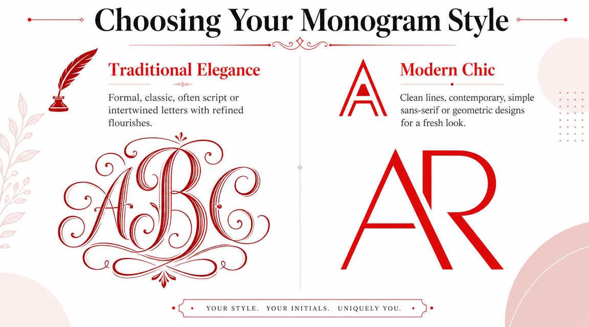
Southern Living's guide draws a useful distinction here. A script font is traditionally seen as more feminine and formal, often used for wedding invitations, while a block or serif font is considered more masculine or neutral, especially for pieces like barware and luggage (Southern Living monogram style guide).
Script styles
Script monograms feel romantic and ceremonial. They suit occasions where softness and movement are part of the mood.
Think of script for:
- Wedding paper details such as invitation accents, favor tags, and menu cards
- Fine linens where a flowing letterform adds grace without needing much scale
- Anniversary gifts that should feel sentimental and heirloom-inspired
Script does require restraint. The more intertwined the initials become, the more important spacing becomes. If the letters are too elaborate, they can blur on smaller items.
Serif and block styles
Serif and block monograms feel cleaner and more architectural. They're often easier to read from a distance and hold up well on practical pieces.
They're especially strong on:
- Bar accessories where clarity matters more than ornament
- Travel and gift items that benefit from a crisp, refined look
- Entertaining pieces that need to pair with many table settings over time
A serif monogram can still feel elegant. It does so with structure rather than flourish.
How to choose without overthinking it
Use the item as your guide.
| Item type | Style that often suits it | Why it works |
|---|---|---|
| Wedding invitation accents | Script | Formal and romantic |
| Cocktail napkins | Script or serif | Depends on whether the table feels classic or clean |
| Barware and bottle gifts | Serif or block | Easy to read and visually balanced |
| Towels and household linens | Single initial, script, or serif | Can lean either decorative or tailored |
If you're exploring personalized options, Jolitee's monogram collection shows how serif and script approaches create distinctly different moods on entertaining pieces.
Decoding Monogram Formats for Couples
The primary source of uncertainty is the letter arrangement. The letters themselves are simple. The order is what trips people up.
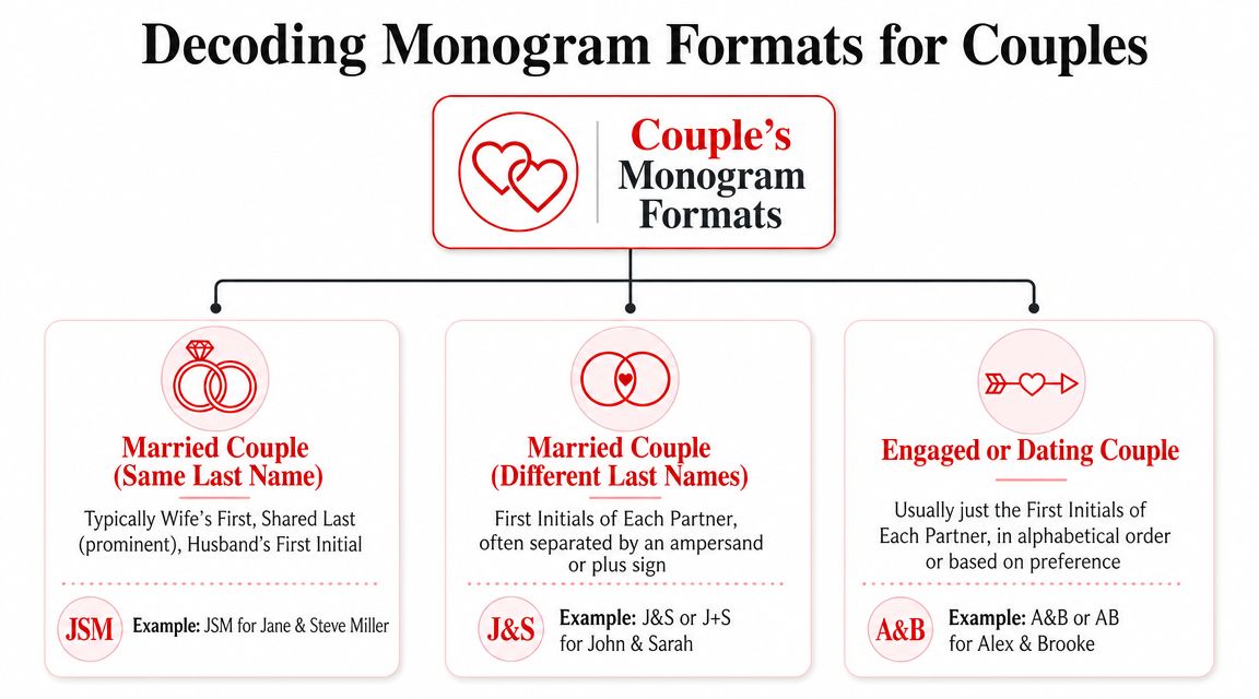
The most widely recognized shared format is the classic three-letter monogram. The Knot explains that in this format, the shared surname initial sits in the center at a larger size, with the two first initials on either side. That arrangement helps legibility and keeps the surname visually dominant, which is why it remains common for household goods and wedding uses (The Knot guide to monogram formats).
Married couples with the same last name
This is the format people recognize most quickly.
Formula: first initial + larger shared last-name initial + first initial
The point of the larger center letter is practical. It anchors the design. The outer initials identify the individuals, while the center tells you the household name.
Common approaches include:
- Traditional order: the woman's first initial on the left, the man's first initial on the right
- Modern preference order: whichever sequence the couple prefers aesthetically
- Alphabetical order: useful when a couple wants a neutral, contemporary approach
If Anna Carter and James Carter want a classic shared monogram, the center letter would be C, with A and J flanking it.
Remember: In a monogram, letters are arranged for design and etiquette. They are not always listed the same way you'd write initials in ordinary text.
Couples who don't share a surname
Old rules become less rigid, and design becomes more collaborative. If there's no shared surname, the monogram shouldn't pretend there is one.
Good options include:
- Two-letter monogram: one first initial from each partner
- Two surname initials: especially useful for a household-oriented gift
- Linked pair design: two initials joined with a small symbol or spacing treatment
- Four-letter format: works when both surnames are central to the identity the couple wants to show
The key is honesty. A monogram should reflect the names the couple uses.
Hyphenated and double-surname couples
Couples with hyphenated or dual surnames often need a structure with more visual support. The Knot notes that shared monograms can use one to four letters depending on surname structure, including formats that emphasize two surname initials for hyphenated or double-surname couples. The same source also notes that approximately 2 million U.S. couples married in 2025, supporting an industry valued at over $100 billion, with an average wedding cost of $34,000 and average spending of $292 per guest, which helps explain why personalized wedding and home-gift categories remain so active (The Knot Worldwide 2026 Real Weddings Study press release).
For a hyphenated arrangement, the surname pair often becomes the visual focal point. That can mean two larger center letters, or a balanced horizontal arrangement if the monogram style is more modern.
Engaged couples and dating couples
For couples who aren't yet using a shared legal or social surname, simplicity is usually the most graceful route.
Try one of these:
- Two first initials
- A minimal stacked design
- A crest-style mark using first initials only
- A single shared motif with initials underneath
This is especially useful for engagement gifts or party details before the wedding. It feels personal without assuming a name change that hasn't happened, or may never happen.
Placing Your Monogram Perfectly
Placement changes everything. A monogram can look refined on one item and crowded on another, even when the letters themselves are correct.
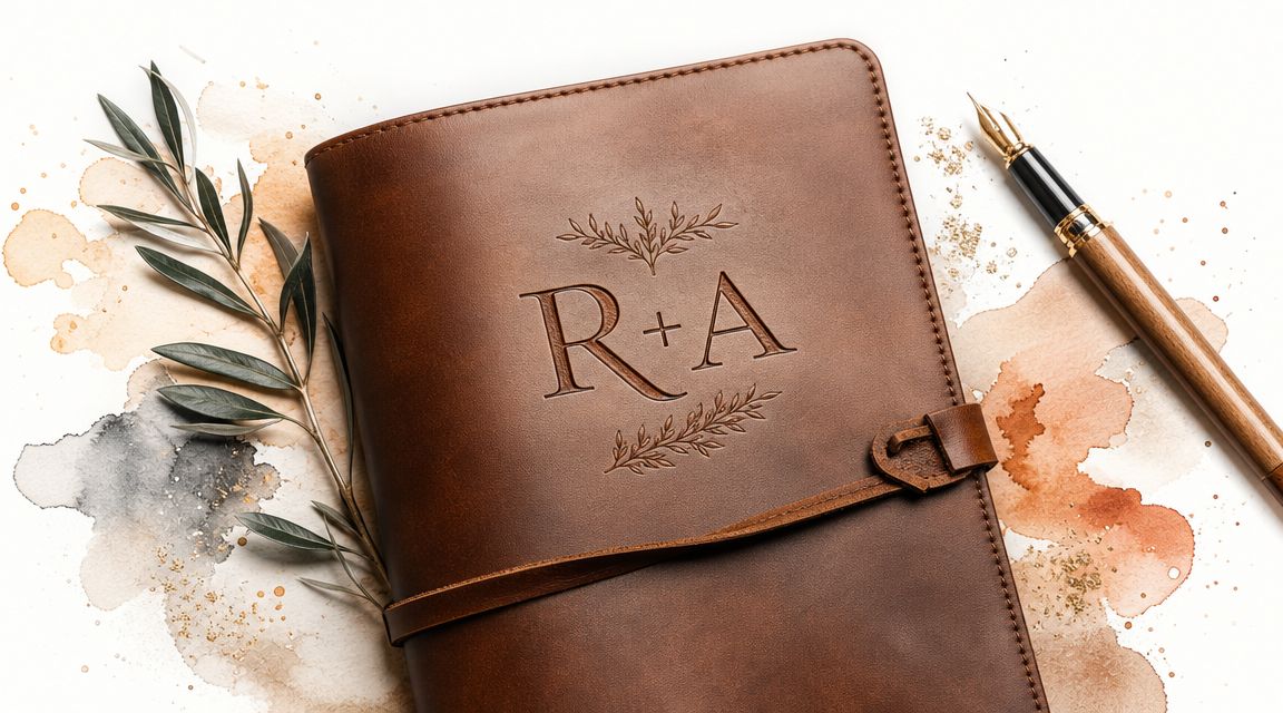
Emily Post's etiquette guidance offers one of the clearest examples of why placement matters. For linens, a monogram on a bath towel is typically placed on the border about 2 inches above the hem, while cocktail napkins are usually monogrammed in one corner for an elegant presentation (Emily Post monograms and cyphers guide).
On cocktail napkins
A corner monogram feels composed because it leaves breathing room. The napkin still functions as part of the table, but the personalization adds a small note of intention.
For entertaining, this is often the sweet spot. Guests notice it while lifting a drink or setting down a glass. It feels polished, not overdone. If you want ideas for scale and styling, Jolitee's article on monogrammed linen napkins is a helpful companion.
On wine gift bags and bottle presentation
A wine gift bag gives you more room to play. A centered monogram can make a stronger statement there because the bag is part of the presentation, not a background element.
For a hostess gift, anniversary dinner, or engagement party, this works beautifully:
- A serif couple monogram for a clean, polished look
- A script monogram for weddings and showers
- A single shared surname initial when you want something understated
That small design choice can turn a bottle into a finished gift.
On towels, journals, and household pieces
Here, scale should follow use. Towels need enough visibility to read, but not so much that the monogram takes over. Journals, trays, and keepsake objects can carry a more decorative treatment because they're handled and noticed up close.
This visual walkthrough can help you think about proportion in motion.
One final point matters for anyone ordering custom work across materials. Bliss & Bone notes that wedding monograms are often supplied as PNG or vector files, and vector is the stronger production format because it scales cleanly across engraving, embroidery, printing, and signage. The same guidance notes that simpler fonts are recommended when more than three initials or tighter arrangements are used, which is wise for hard goods and textured surfaces (Bliss & Bone wedding monogram guidance).
Shop the Look: Personalized Entertaining
A couple's monogram feels most at home when it's used on pieces people bring out, share, and enjoy. Entertaining essentials do that beautifully.
For gifting and hosting inspiration, start with:
- Monogrammed Hemstitch Cocktail Napkins for engagement parties, wedding showers, and anniversary cocktails
- Personalized Wine Gift Bags for host gifts, dinner parties, and celebratory bottle presentations
- Thoughtful gifts and entertaining accessories when you want a monogram to be part of a larger, ready-to-give moment
If you're building a gift around home linens too, this Guide to waffle kitchen towels offers useful texture and utility context for pairing practical pieces with decorative ones.
For more gift ideas specifically designed for pairs and newlyweds, see Jolitee's best personalized gifts for couples.
Frequently Asked Questions About Couple Monograms
Can same-sex couples use traditional monogram rules
Yes. The most graceful approach is the one that reflects the couple's actual names and preferences. If they share a surname, a classic center-surname format can work beautifully. If they don't, alphabetical order or a balanced two-initial design often feels clear and modern.
Should you use a married monogram before the wedding
Usually, it's safer to use first initials only for engagement gifts or pre-wedding events unless the couple has clearly chosen a married monogram already. That keeps the gift personal without assuming timing or naming decisions.
Is a single initial ever enough
Absolutely. A single shared surname initial can look elegant on towels, cocktail napkins, barware, and household pieces. It's especially useful when you want a quieter look or when a full multi-letter monogram feels crowded.
What if the couple keeps different last names
Use a format that tells the truth. Two first initials, two surname initials, or a balanced linked design all work. The best monograms for couples don't force one family model. They reflect the one the couple lives.
How do you choose between script and serif
Think about the item first, then the mood. Script suits formal paper, romantic gifts, and soft linens. Serif works well for custom entertaining pieces, bottle gifts, and bar accessories where clarity matters.
A well-made monogram doesn't need to follow every old rule. It needs to feel intentional, legible, and true to the couple it represents. If you're ready to turn that idea into a polished gift or party detail, browse the personalized entertaining and gifting pieces at Jolitee.