
Monogram Design Ideas: 8 Styles for Hosts and Gifts
A host walks in with a bottle under one arm and a stack of napkins in the other, and the question is immediate, which monogram would have made the gift feel more considered? The right answer depends on the occasion, the recipient, and the product it sits on, not just on the lettering itself. A holiday wine bag calls for a different treatment than a folded cocktail napkin, and both should feel chosen rather than generic. If you want a quick spark for the table side of the equation, find a free table runner pattern can help anchor the rest of the setting.
The strongest monogram design ideas follow a simple logic, they match style to use. Some lean formal, some feel romantic, some read modern and spare. The eight styles below are the ones I reach for most often when I'm styling a host gift, setting a bar cart, or choosing the right finish for a reusable bottle bag or hemstitch napkin set.
1. Classic Serif Monogram
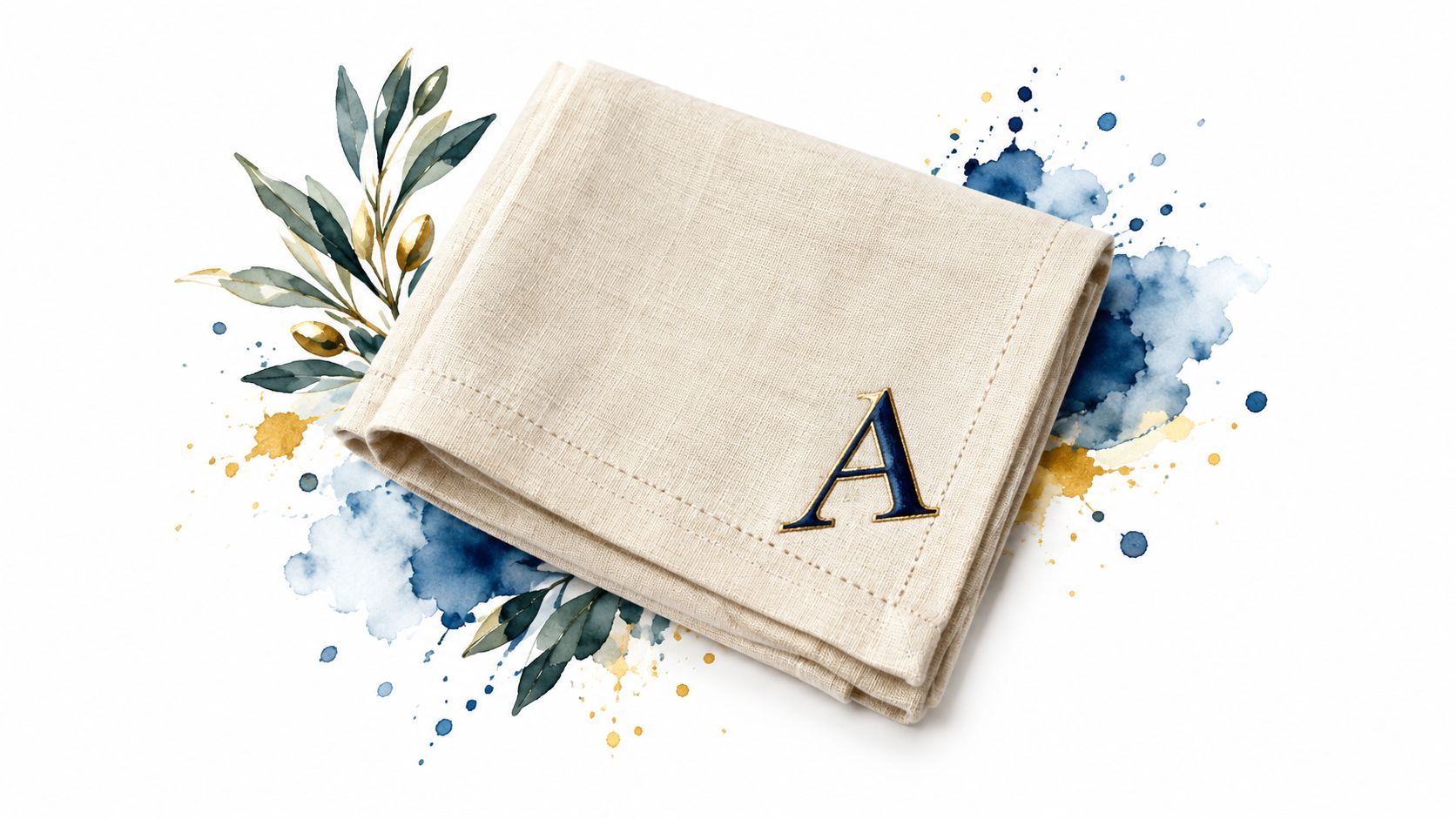
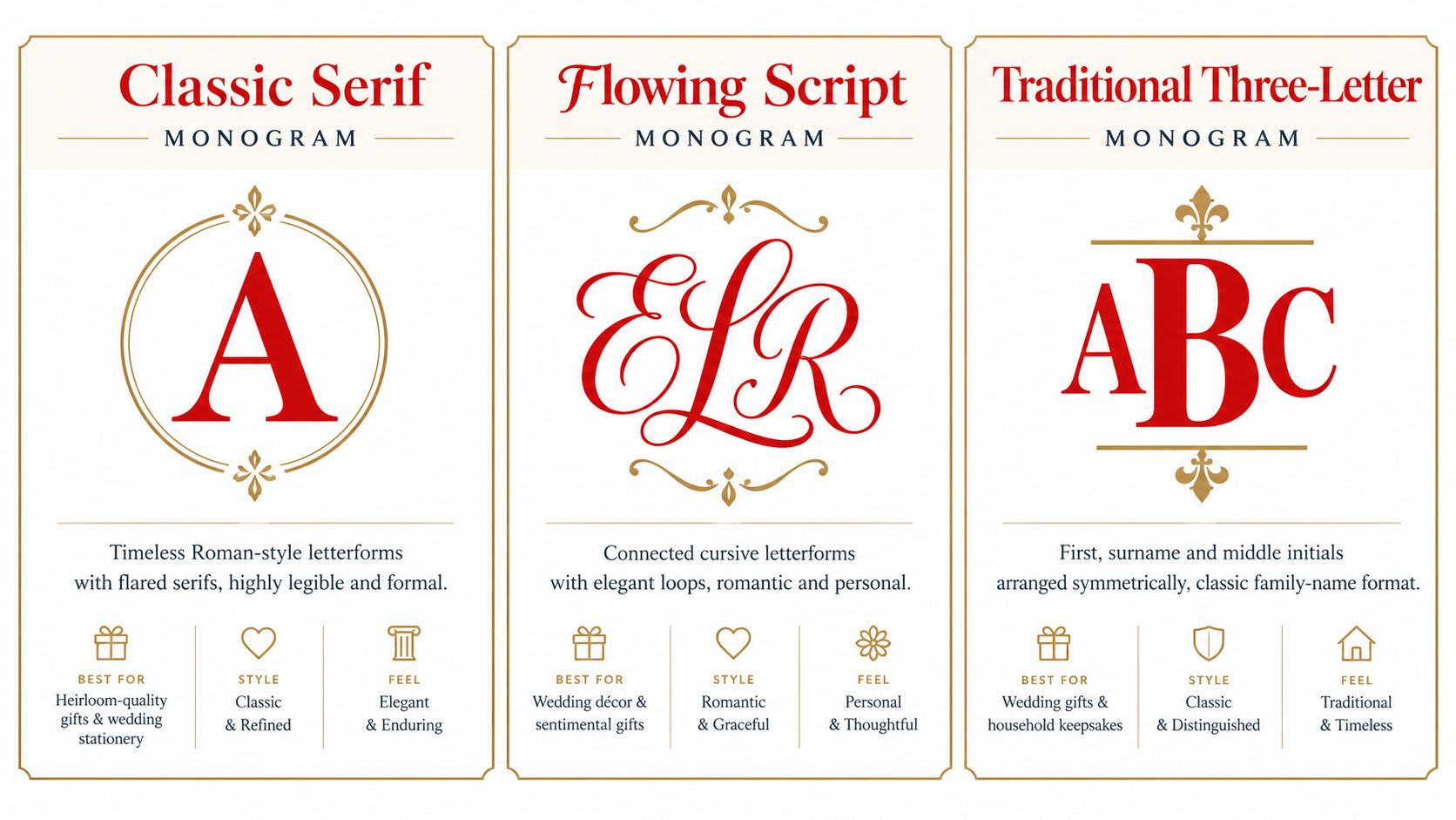
A classic serif monogram suits a setting that calls for steadiness and restraint. The letters stay easy to read, which matters on pieces that will be handled, folded, or seen across a table. That makes this style a strong fit for linen napkins, wedding favors, and a bottle bag you bring to a dinner host.
The form also carries history. Britannica's monogram overview describes a monogram as a cipher that began with one letter and later combined two or more letters, often for a person's name or initials. Serif initials still feel authoritative because that older lineage is part of the appeal.
Where it works best
I reach for a single bold initial on cocktail napkins. The format is compact, and the serif gives the letter enough presence without crowding the fabric. On larger pieces, a three-letter layout feels more complete and more formal.
That makes this style a good match for wedding stationery, heirloom-style hostess gifts, and table settings that need one polished focal point. A serif monogram also suits a holiday wine bag, especially when the rest of the presentation stays simple.
Practical rule: keep the composition simple on small items. Once a mark is folded, stacked, or seen from the far side of the table, dense letterforms start to look fussy.
Use one ink color and leave breathing room around the letters. On a small napkin, a little extra space helps the serifs stay crisp. On a wine bag, ribbon or a tag can finish the look without competing with the monogram.
2. Flowing Script Monogram
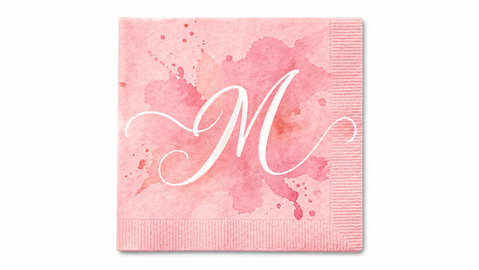
A flowing script works best when the gift is meant to feel personal. It suits bridal showers, baby gifts, and housewarming pieces, especially a blush napkin set or a canvas bottle bag. The trade-off is simple. Script brings warmth and movement, but it needs space or the letters start to blur together.
Keep the flourish under control
On a small surface, one or two letters is usually enough. That keeps the mark readable and still gives it personality. For a canvas bottle bag, let the script carry the attention and keep ribbons, tags, and extra patterning quiet.
Jolitee's script monogram collection shows how a flowing initial looks on real napkins and bottle bags before you commit. That matters because script is easiest to read when the form stays open and the surface gives it room.
Reading research shows that familiarity and character differentiation matter more for legibility than typeface style, which is why compressed script becomes hard to read. The NIH-indexed typeface research fits what shows up at the table, a flourish works when the letters are clear and the layout is not crowded.
Choose the drama level by occasion. Bridal pieces can take more softness and curve. A housewarming bottle bag should still read cleanly from arm's length.
3. Traditional Three-Letter Surname Monogram
The three-letter monogram is the classic family format, with the surname initial centered and larger than the first and middle initials. That structure gives it a crest-like presence, which is why it works so well for family gifts, wedding sets, and table linens that are meant to represent more than one person. It feels composed without needing ornament.
This format is especially strong on larger pieces like wine bags and runners, where the full arrangement can breathe. A Thanksgiving table runner with a three-letter monogram makes the whole setting feel anchored. A couples' gift set also benefits from the symmetry, because the centered surname carries visual weight and signals shared ownership.
How to keep it readable
Order matters, so confirm the initials before you print anything. For a cleaner result, let the surname stand out by using a slightly lighter treatment on the outer initials. That keeps the middle letter from disappearing into the background.
A few practical choices help this format perform well:
- Use larger surfaces: wine bags, table linens, and tote bags give the layout enough width.
- Keep the treatment consistent: one family mark should appear the same across the whole set.
- Avoid over-decoration: a strong letter arrangement doesn't need extra flourishes to feel complete.
Historical monogramming supports this kind of formal organization. By the fifth century BCE and later, monograms appeared on Greek coinage to identify municipalities, mints, rulers, and officials, and more than 500 ancient monograms are known from coins and manuscripts, even if some remain undeciphered. That scale says something important, the format was used as a practical identity system long before it became a decorative one. Sarah Emily Bond's discussion of monograms and inscribed power shows how wide that visual practice really was.
4. Interlocking Monogram
An interlocking monogram is the boldest graphic choice in this list. Two letters overlap and share strokes, so the result feels compact, decorative, and a little more luxurious than separated initials. It has presence on a bottle bag, bar towel, or wedding wine label because it reads like a single emblem instead of a sequence of letters.
I prefer interlocking forms when the gift needs to feel custom but uncluttered. On a bar setup, that usually means letting the monogram sit on one focal object and keeping everything else quieter. One strong emblem is enough.
The legibility test matters here
A good interlocking mark has to survive both black and white treatment. If the overlap becomes muddy in one color, it'll get worse on textured fabric or small digital previews. That's why this style works best with two letters that naturally balance together, rather than forcing a clever combination that only looks good at one size.
Historical precedent supports the compact logic. Ancient coin and seal formats demanded small, stable silhouettes, so the design principle was always about compression and recognition. That's useful to remember when you're putting initials on drinkware or a reusable gift bag, because the mark has to read quickly, not just beautifully. The same article by Sarah Emily Bond points to monograms as a widespread administrative and visual practice, not a niche ornament.
Use it when you want one piece to carry the whole message. A wedding wine label, a monogrammed bar towel, or a single statement bag can handle that weight. A crowded table can't.
5. Wreath or Circular Seal Monogram
A circular seal gives a gift a finished edge. The ring frames the initials and fits naturally on round or compact surfaces, including labels, coasters, plates, and small bottle packaging. Its shape recalls vintage crests and wax seals while remaining clean enough for a modern table.
Choose this style for a holiday host or a gift that needs a celebratory mark. A laurel wreath on a Jolitee holiday wine bag adds occasion without covering the bag's main surface. On cocktail napkins, a circular seal suits a garden party, especially when the tableware and linens stay simple.
Keep the border simple
The wreath should support the initials. Fine leaf detail can blur when printed at a small size, particularly on fabric. One strong initial or two well-spaced initials usually fill the circle more clearly than a crowded arrangement.
Placement also affects the result. Center the seal on a wine bag, label, or napkin corner, then repeat that position across the set. Match its color to the napkin trim or the bag accent. The repeated detail ties the gift or table setting together without making the monogram feel pasted on.
A circular mark solves a practical placement problem. It gives small surfaces a natural edge and keeps the composition centered.
The form also has a long emblematic tradition. The Chi-Rho combines the first two Greek letters of the word for Christ and became a prominent Christian symbol. Its compact structure shows how initials can work as a recognizable emblem, not only as personal decoration. That history helps explain why a circular seal feels established on a holiday wine bag, a formal label, or a set of Jolitee cocktail napkins.
Use a restrained wreath when the occasion calls for polish, but the product has limited space. The border adds ceremony; the open center keeps the mark readable.
6. Minimalist Single-Initial Monogram
A single initial is the quietest option, and that's the point. It suits modern interiors, restrained gift packaging, and hosts who prefer a cleaner look at the table. When you only need one character, the design feels confident rather than busy.
Make the placement do the work
A minimalist initial looks best on neutral backgrounds like ivory, sage, or charcoal. Put it in the same spot across a set and it suddenly feels intentional, almost architectural. That matters on bottle bags, passport holders, and napkins, where consistency can carry the whole presentation.
The fastest way to ruin this style is to over-style it. One accent color is enough. A bigger outline, a second border, and a decorative corner all at once make the monogram look unsure of itself.
The historical logic still applies here. Monograms began as compact systems for identity, authority, ownership, and recognition, not as clutter. Britannica's definition and the coin evidence behind it make that clear, and the same principle translates neatly to modern gift wrapping and table styling. The less the mark has to say, the more precise it needs to be.
If you're choosing for a minimalist host, this is often the right move. It doesn't ask for attention, but it still gives the gift a name.
7. Monogrammed Canvas Wine Bag
A monogrammed canvas wine bag turns a standard bottle into a finished host gift. The bag adds reuse value, so the presentation doesn't end at the front door. It can go back into rotation for farmers market trips, picnics, or travel, which makes the personalization feel practical instead of fleeting.
Monogram placement matters here more than people realize. The front panel gives the mark the clearest focal point, while the side gusset can feel more subtle. If the bottle itself is the star, the monogram should frame it rather than compete with it.
Style the bag to match the person, not the bottle
Choose a monogram that fits the recipient's home, not just the event theme. A serif layout feels right for a polished dinner host. A circular seal feels better for holiday gifting. A minimalist initial works well when the rest of the presentation is clean and simple.
Jolitee's wine gift bag ideas for hosts are useful here because they show how bottle packaging can carry the same visual care as the gift inside. A folded card or tag tucked into the bag gives the gesture more warmth. Keep the bag unfolded until presentation, so the monogram shows cleanly and the fabric doesn't crease across the lettering.
When the bottle comes out, the bag still has a second life. That strength of this application, it turns a one-night presentation into a reusable object with memory attached.
8. Monogrammed Hemstitch Cocktail Napkin
Monogrammed hemstitch cocktail napkins are one of the easiest ways to make a bar cart or appetizer table feel composed. The hemstitch edge adds a refined border, and the monogram gives the set a personal anchor. The result is small, but it changes the whole surface around it.
Because cocktail napkins are compact, the design has to work harder. Common formats are around 5-by-5 inches or 6-by-6 inches, with some hospitality styles closer to 6-by-9 inches, so the monogram occupies a large share of the visible area. Napkin sizing and use context makes it clear why a simple initial or restrained interlock usually reads best.
Placement changes everything
Set napkins in a fan or stacked display so the monogram stays visible. If the napkin folds over the artwork, the whole point disappears. Keep the lettering away from the folded edge, and preview the design in the exact presentation you plan to use.
A practical setup looks like this:
- Use a single initial for small cocktail service: it stays readable when guests grab it quickly.
- Match the monogram color to the tabletop: that creates a quiet, finished look.
- Keep a bowl of extras nearby: practical service matters as much as style.
Jolitee's monogrammed linen napkin inspiration is especially useful for this format because it connects the styling to actual entertaining use. The best napkin monogram feels like part of the host's rhythm, not a separate decoration. It should look good on the bar, but it also has to work when a guest picks it up with a glass in hand.
8-Style Monogram Design Comparison
| Style / Application | Implementation Complexity 🔄 | Resource Requirements ⚡ | Expected Outcomes 📊 | Ideal Use Cases 💡 | Key Advantages ⭐ |
|---|---|---|---|---|---|
| Classic Serif Monogram | Low, set in existing Roman-style typefaces | Low, single-color print/engrave; standard vectors | Timeless, formal, highly legible | Wedding stationery, linens, hostess gifts | Clear readability; versatile across items |
| Flowing Script Monogram | Medium, careful kerning and size balance required | Medium, high-res artwork; test at final size | Romantic, personal, elegant flourish | Bridal showers, wedding décor, sentimental gifts | Warm, distinctive, decorative accent |
| Traditional Three-Letter (Surname) Monogram | Medium, layout with larger center initial and correct order | Medium, needs space; best on larger surfaces | Heritage, family-identifying, polished look | Family gifts, totes, table linens, wedding sets | Symmetrical, instantly recognizable family format |
| Interlocking Monogram | High, custom overlaps and stroke matching | High, vector design and legibility testing at small scale | Compact, upscale, emblematic/brand-like | Couples' gifts, barware, labels, drinkware | Striking visual impact; scalable across sizes |
| Wreath or Circular Seal Monogram | Medium, integrate motif and initials while preserving legibility | Medium, decorative elements may need simplification for small prints | Formal, finished, crest-like badge | Coasters, plates, wine labels, invitations | Balanced on round surfaces; traditional charm |
| Minimalist Single-Initial Monogram | Low, single character, simple placement | Low, minimal production needs | Modern, understated, sophisticated | Gift tags, small linens, contemporary décor | Subtle, cost-effective, easy to coordinate |
| Monogrammed Canvas Wine Bag (Application) | Low–Medium, placement and monogram style choice | Medium, canvas printing/embroidery; panel size limits | Practical, reusable personalized presentation | Hostess gifts, bridesmaid gifts, wine presentation | Eco-friendly, functional keepsake; intentional presentation |
| Monogrammed Hemstitch Cocktail Napkin (Application) | Low–Medium, precise placement with delicate hemstitch | Medium, fine stitching care; small-scale legibility | Refined tablescape accent; elevated detail | Bar carts, cocktail parties, weddings | High-impact small item; luxe finishing touch |
Choosing Your Monogram Style for the Next Gift
The easiest way to choose a monogram style is to work backward from the moment it will serve. A holiday wine bag needs a mark that reads fast and feels polished. A cocktail napkin needs a compact design with enough contrast to survive folds, stacking, and quick use. A wedding gift can carry more flourish, while a reusable host bag should still feel practical after the evening ends.
Start with the occasion, then consider the recipient, then match the mark to the product. If the gift is formal, a classic serif or traditional three-letter format usually feels right. If the mood is softer or more romantic, script or a circular seal can add that touch without overwhelming the piece. If the style is modern and restrained, a single initial often does the job better than a busy layout.
Consistency matters once you choose the direction. Use the same monogram treatment across the set when possible, especially if you're pairing a bottle bag with cocktail napkins or building a hostess bundle. One clear system looks more intentional than several unrelated styles trying to share the same table.
The best monogram design ideas don't just decorate, they organize the gift. They tell the guest who it's for, they guide the eye across the table, and they make the packaging feel part of the experience instead of an afterthought. That's why monograms still work so well for entertaining, they compress identity into a form that can be placed, carried, displayed, and remembered.
If you're building a gift around that idea, browse Jolitee's monogram wine bags and hemstitch cocktail napkins together. A matching pair gives you a host-ready set that feels coherent from the bottle presentation to the final pour.
Jolitee offers monogrammed wine bags and hemstitch cocktail napkins that make gifting and entertaining feel coordinated. If you're styling a host gift or building a table setting, visit Jolitee to browse pieces that can carry the same monogram from the bottle to the bar.